Vibrant sans Garish
A follow-up question landed in my mailbox following a recent webinar. Webinar participant and writer Mark asked:
The color shot that you processed last evening had soft, subtle color. You developed it appropriate to the scene. However, I have for some time admired the way you handle bright color. In your online gallery you have sections of color pictures that are very eye-catching and impressive. For example, many of the shots in "Desert Color" and "Mountains of Color" have luminous, saturated colors - vibrant without being garish. Could you comment generally on your approach to bright colors in post processing?
Thank you, Mark! It's a great question, because what I am about to describe may not be readily apparent to those who view my images. It's a three part answer:
- Quality of light
- Quality of color
- My approach to development of the photograph.
Especially in the galleries you cite, note that the form of light I typically enjoy working with is open shadow (no direct light), and with color that is not already inherently saturated. I may find a composition earlier in the day under direct light, but will visualize the final print in soft, luminous light and will return at the appropriate time to make it happen. This quality of light provides me with generous latitude for development of the print, as I will be less limited by higher contrast and higher dynamic range. I also believe that color becomes washed out and sometimes corrupted by direct light. Pick a colorful spot sometime - it can be in your yard - near sunset, and watch (or photographically observe) the way the color seems to increase while contrast decreases, as the sun lifts away from directly lighting your chosen object/scene.
I use Curve adjustment layers to perfect and nudge the light and [soft] contrast right where I want it. I generally add saturation only to particular colors and only to particular areas of the frame (using Photoshop Hue/Saturation layers and masking). Saturated color is my goal, but I abhor garish use of the tool. Often apparent saturation may be provided merely by color contrasts/compliments. In the end, my desired result is to arrive at a print that feels faithful to what I perceived when I experienced it, but I will use all the tools available to me to enable my prints to reach peak performance of my original scores (to paraphrase Ansel). I am not adding any components or color to a frame that are not already found there, regardless how latent that color may be in the RAW file.
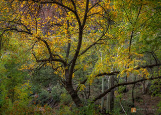
Have a look at the included photograph. I made this photograph in a deep mountain canyon, about two hours before sunset. Because it's late October, the light at this hour in this particular location is already ideal. I have provided both an unadulterated RAW file + my print-ready development. Observe that what I have largely done is awakened the light and color. They were there, I saw them with my own eyes, yet my camera is absent a brain and has a much more compressed range of color and light available to it than I do. I restored that in the final version.
My goal is to always make the most beautiful prints I can. To quote a context-useful cliché, to make them sing. As photographers, what we are literally doing is "drawing with light" (from the Greek words phōs (light) and graphē (writing or drawing). Speaking only for myself, light is the linchpin of my photographs. No matter how great the color, if the light isn't there, the photograph doesn't get made.
I hope this short post helps you find those luminous, saturated colors in your work, Mark! Thank you for the question.